Sign-in screen appearance
The kit’s authentication screens — login, registration, password request and reset, e-mail
confirmation, two-factor challenge and session lock — have two layouts, and whoever administers
the application picks one in Configurações da aplicação › Telas de acesso (application settings › sign-in screens)
(/admin/configuracoes-da-aplicacao?tab=telas-de-acesso), looking at a preview that follows every
change before saving. With organizations on, each organization can use the default appearance or
have its own.
Nothing changes by itself: while nobody picks another layout, the screens stay exactly as they always were — including in projects that update the kit.
See what you can do
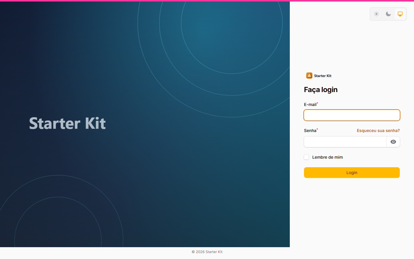
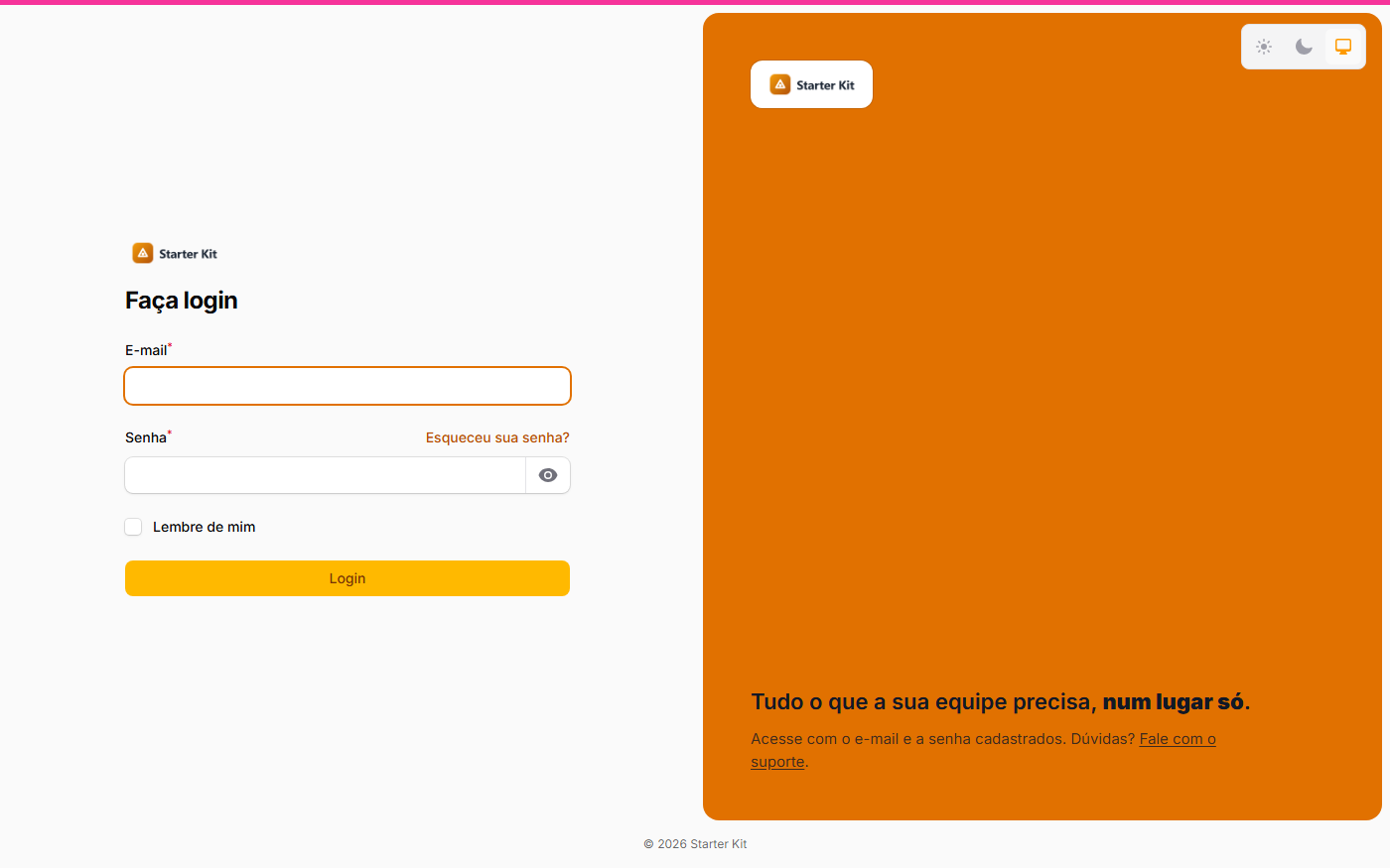
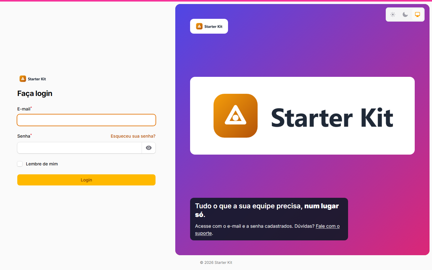
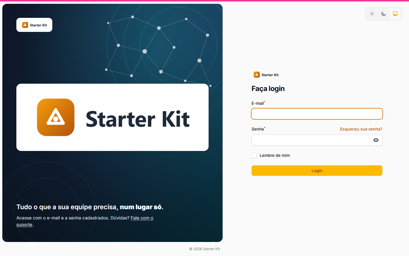
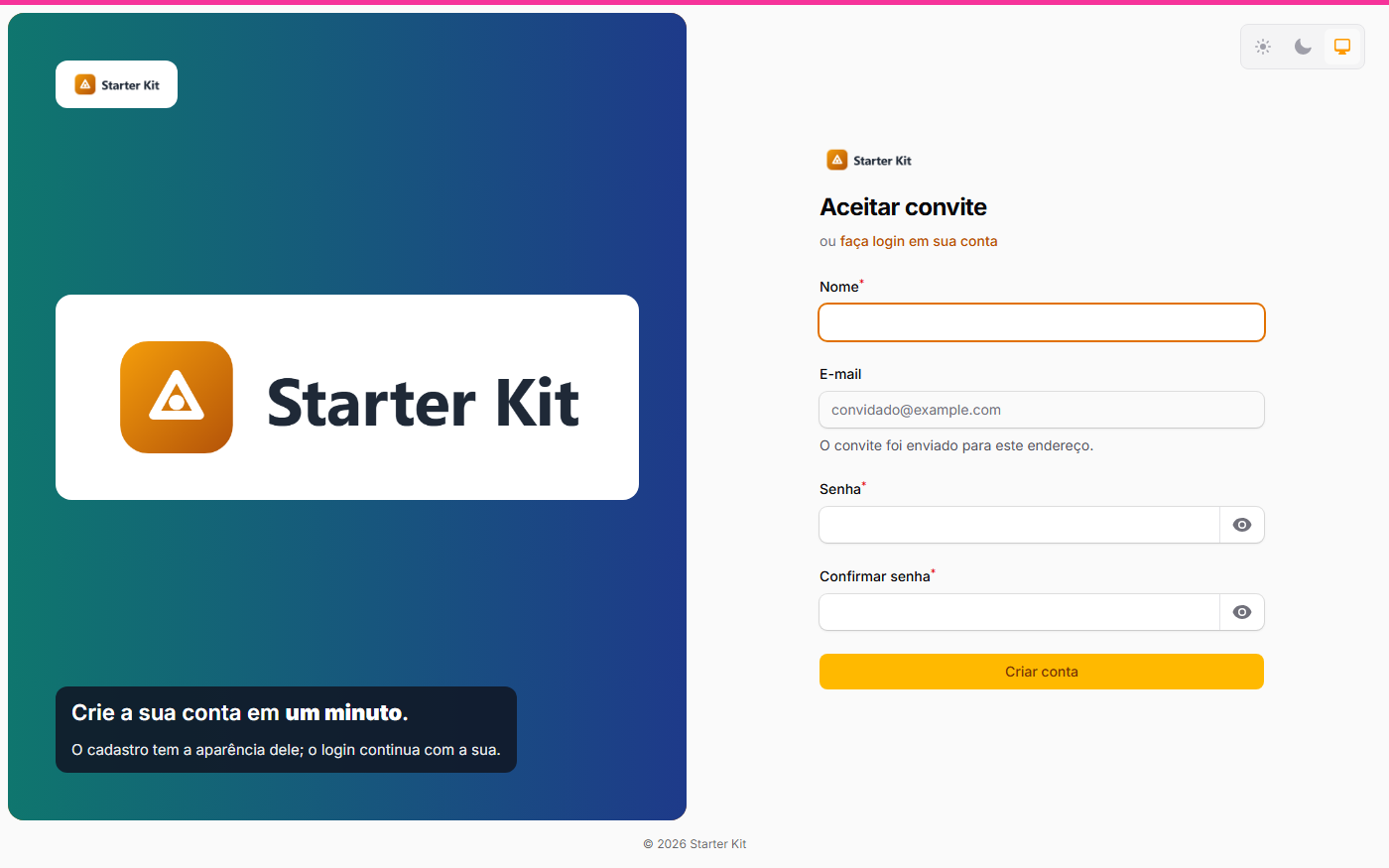
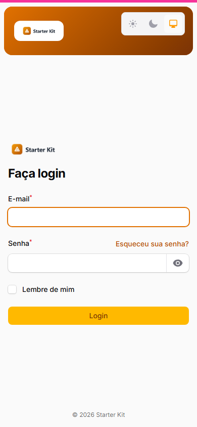
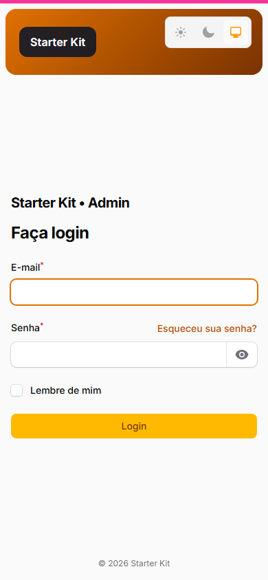
Each frame below is the same login screen with a different combination of options — all set on the settings screen, no code.
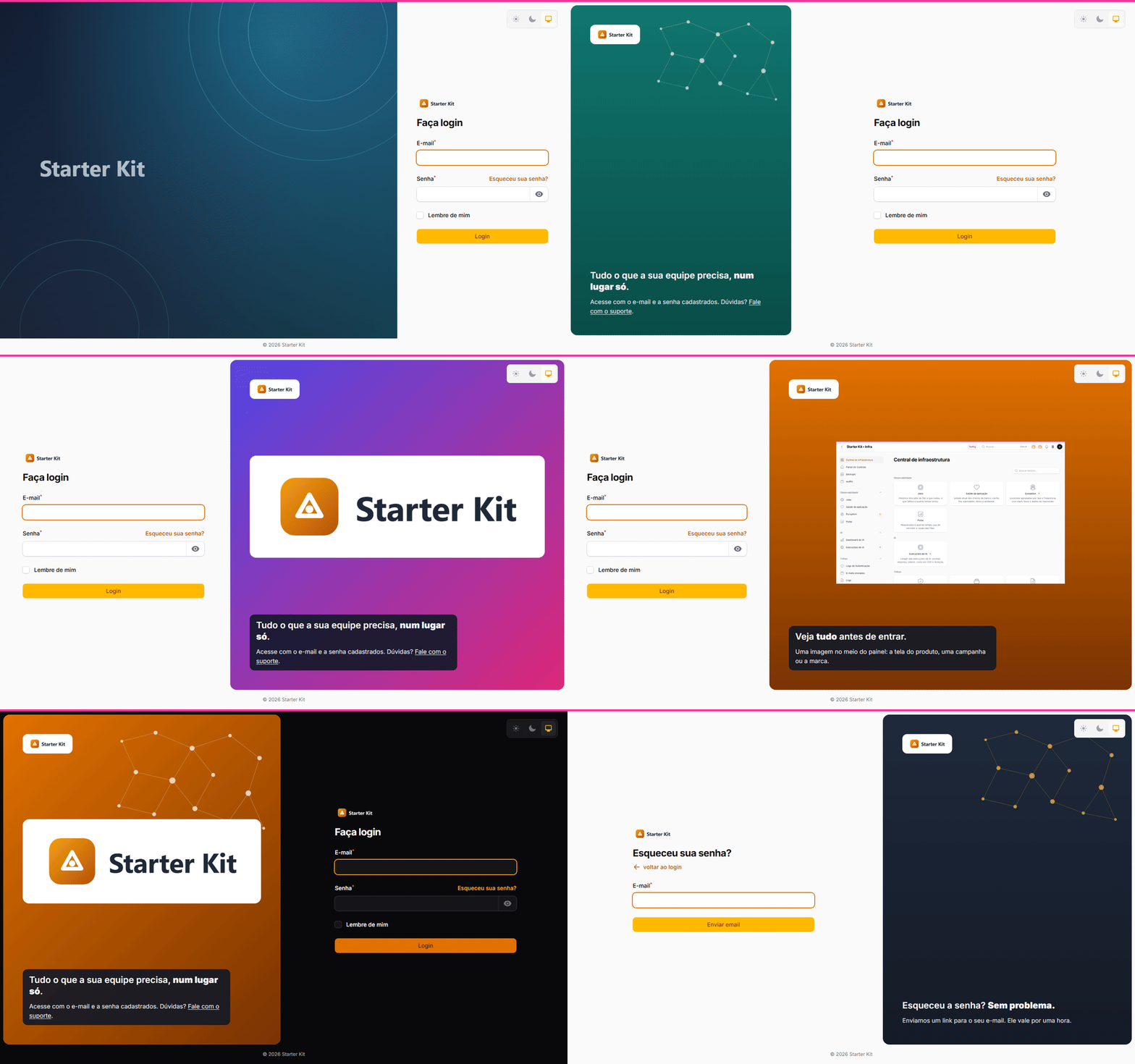
Click an image to see it full size.
 |
 |
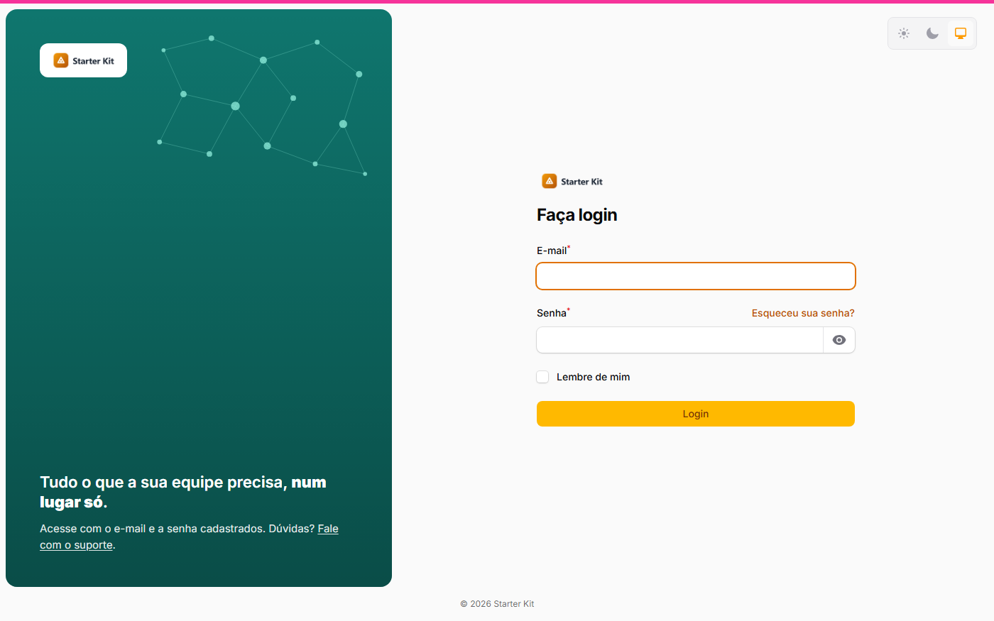 |
| Classic (the usual default) | Panel in the Filament primary color | Own color, form on the right, 40% panel and still network |
 |
 |
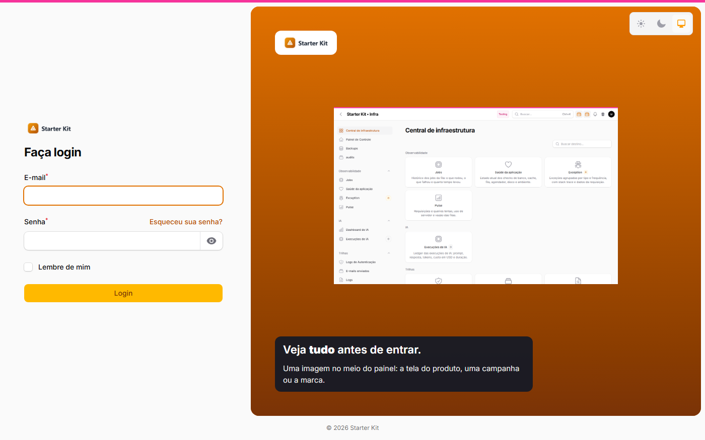 |
| Diagonal gradient with the big logo in the middle | Background art, logo in the middle and dot network | Your own image in the middle, vertical gradient |
 |
 |
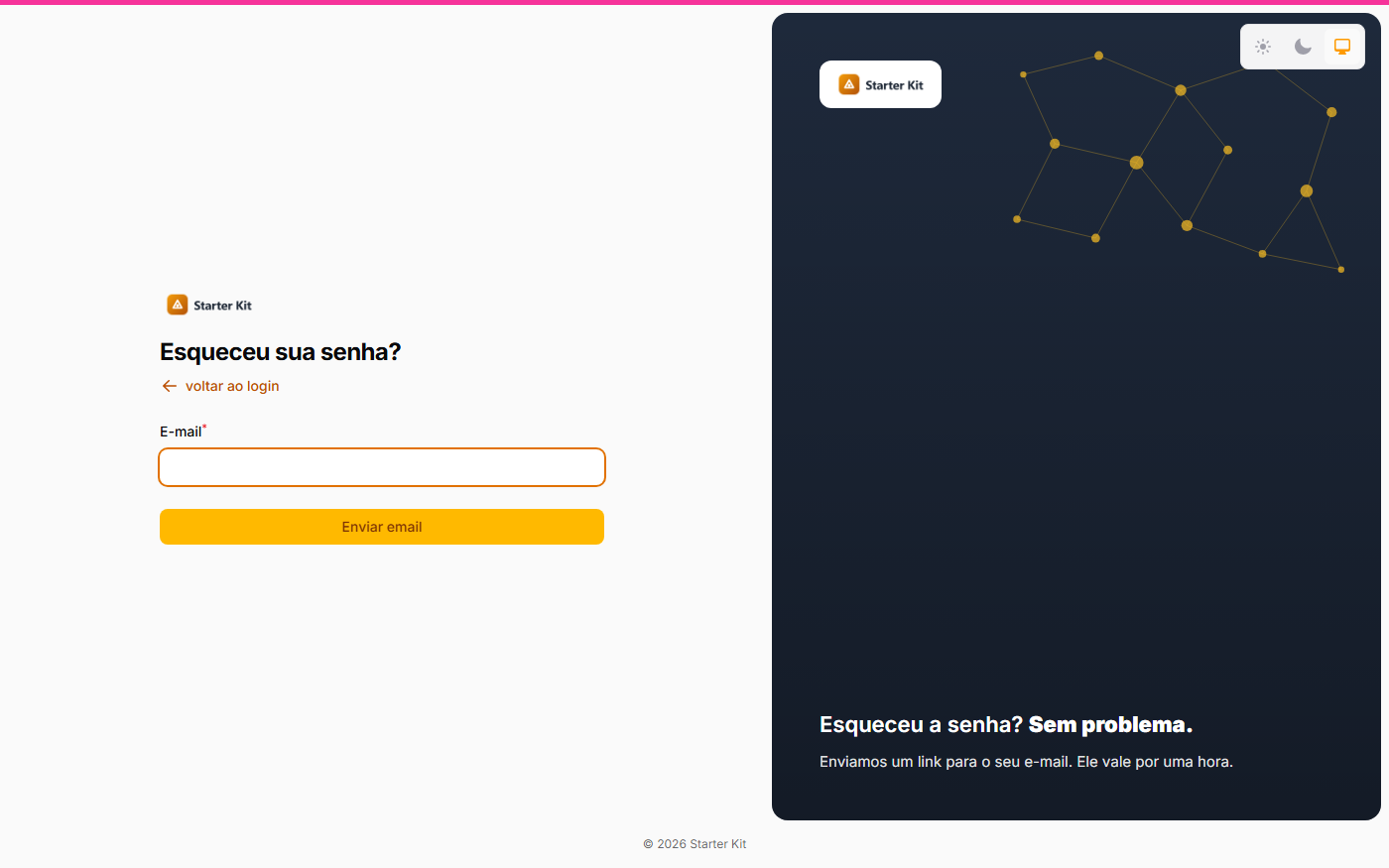 |
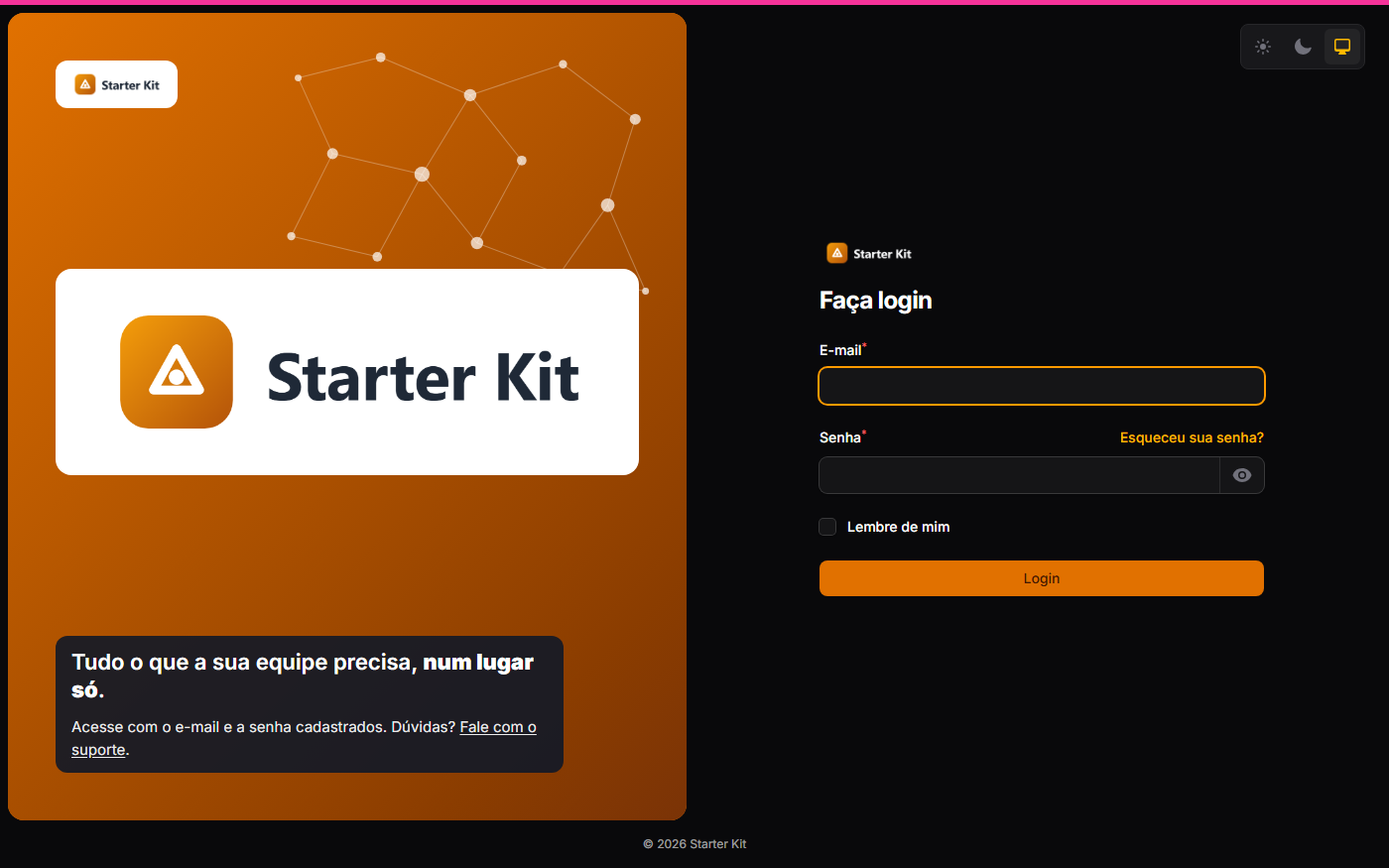
| Dark theme, with the dark logo | Sign-up with its own appearance | Forgot password with its own appearance |
| On a phone, with the logo | On a phone, no logo (app name) |
|---|---|
 |
 |
The two layouts
| Layout | What it looks like | When to use it |
|---|---|---|
| Classic (the default) | The artwork takes most of the screen (70%) and the form sits beside it: on the right on the login, on the left on the other screens. Below 1024 px wide the artwork disappears and the form takes the screen | Whoever already uses the kit and wants no change at all; whoever prefers the large artwork |
| Brand panel | The screen splits between the form and a rounded panel with your brand — you choose the width (30% to 70%) and the side. On the panel: color or artwork background, the logo on a light badge, a centerpiece (the logo, large, or an image of your own), a network-of-dots illustration — still or moving — and two optional sentences. On phones the panel does not disappear: it becomes a short strip above the form, with the logo only (or the application name, when there is no logo) | Whoever wants an entrance with identity, a message and the same look on phones |
The chosen layout applies to the authentication screens dressed by the Auth Designer in the three panels — login, registration, password request and reset, e-mail confirmation, two factors and session lock; the panel choice, shown after signing in, stays as it is — (/admin, /app,
/infra) and to the single pages /login, /cadastro and /esqueci-minha-senha, when the single
login page is on.
| Brand panel (desktop) | Brand panel (phone) |
|---|---|
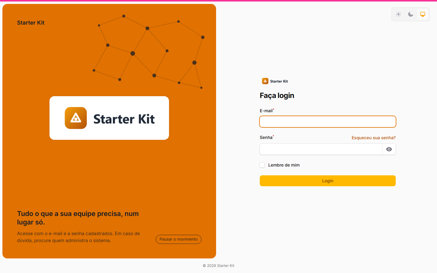 |
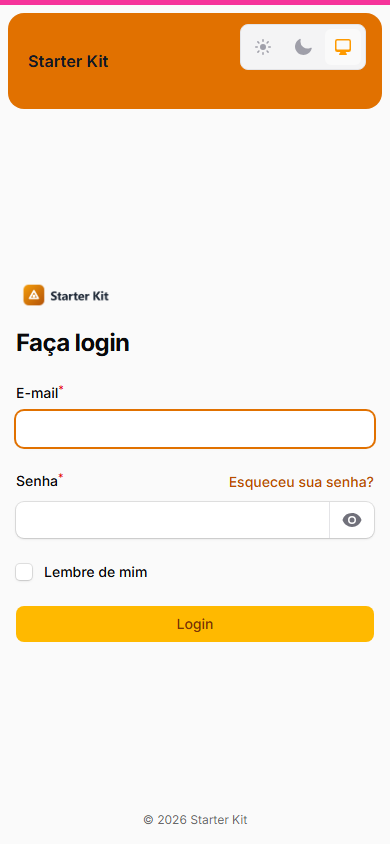 |
| Artwork background, centerpiece and network | Dark theme |
|---|---|
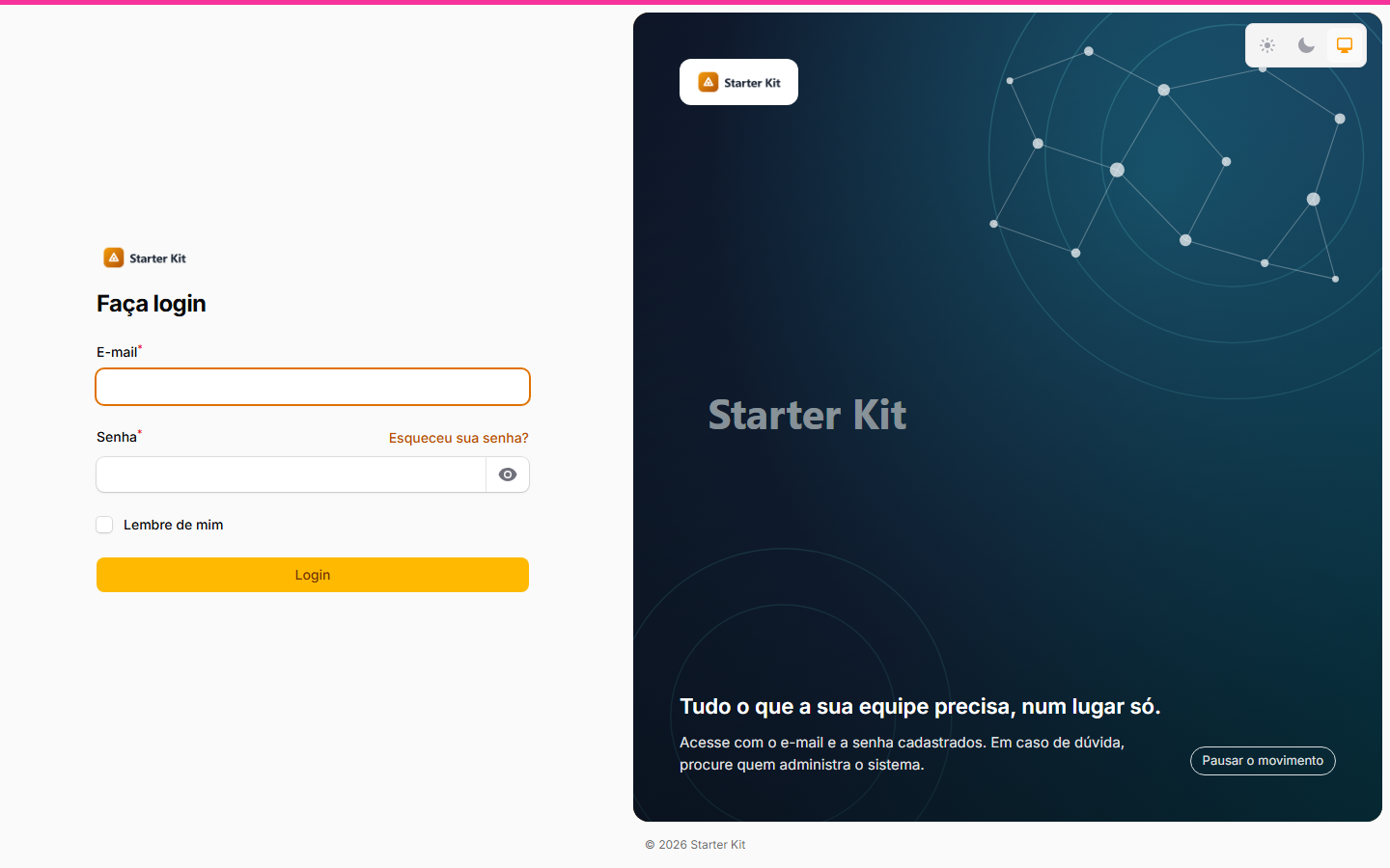 |
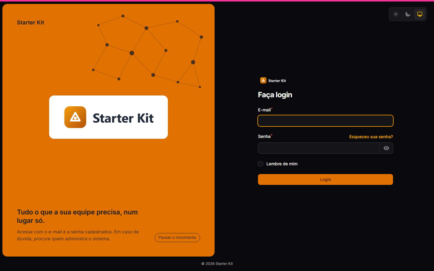 |
One appearance per screen
The editor has three collapsible sections: Login, Cadastro (sign-up) and Esqueci a senha (forgot password). Each one has the same options, and the last two start with the Igual ao login (same as login) switch on — the screen follows the login, including future changes. Switched off, the screen gets its own appearance, starting as a copy of the login at that moment. That is how you put, for example, the login form on the right and the sign-up and forgot-password forms on the left.
| Section | Applies to |
|---|---|
| Login | login, two-factor challenge, session lock and e-mail confirmation |
| Cadastro | open sign-up and invitation acceptance |
| Esqueci a senha | password request and password reset |
| Login on a gradient | Forgot password with the form on the left |
|---|---|
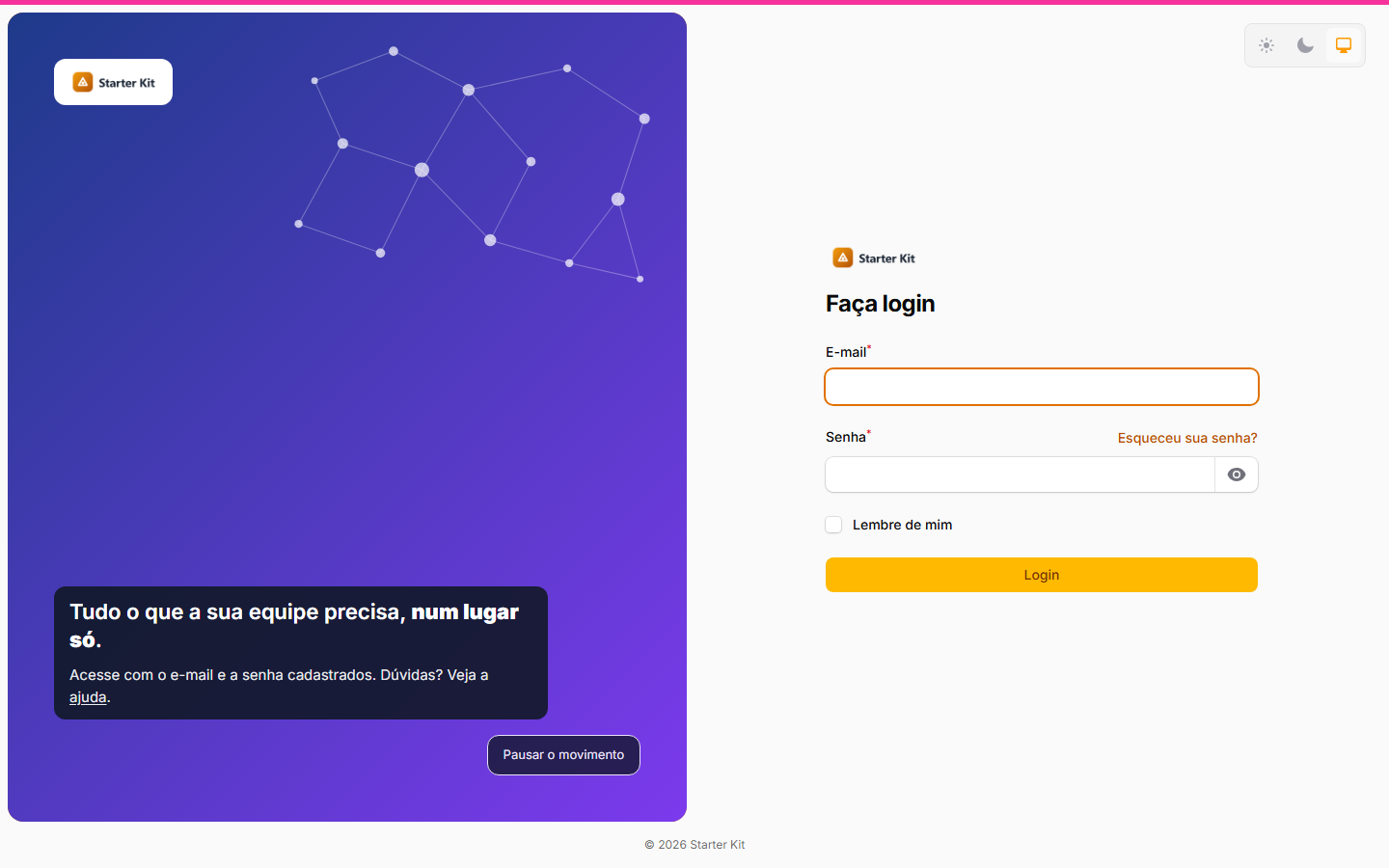 |
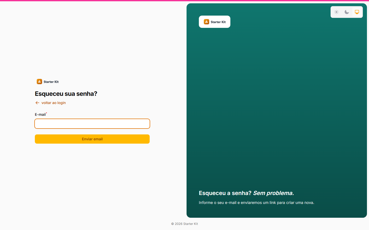 |
Each screen may even have a different layout: the login on the brand panel and the forgot-password screen on the classic, or the other way around. An organization with its own appearance has the Login and Cadastro sections; the forgot-password screen doesn’t know which organization the person belongs to and always uses the default appearance.
Social login and the anti-bot challenge stay where they always were, inside the form, in any layout and on any screen: with a social provider configured, its button shows; with anti-bot protection on, the challenge shows.
Brand panel options
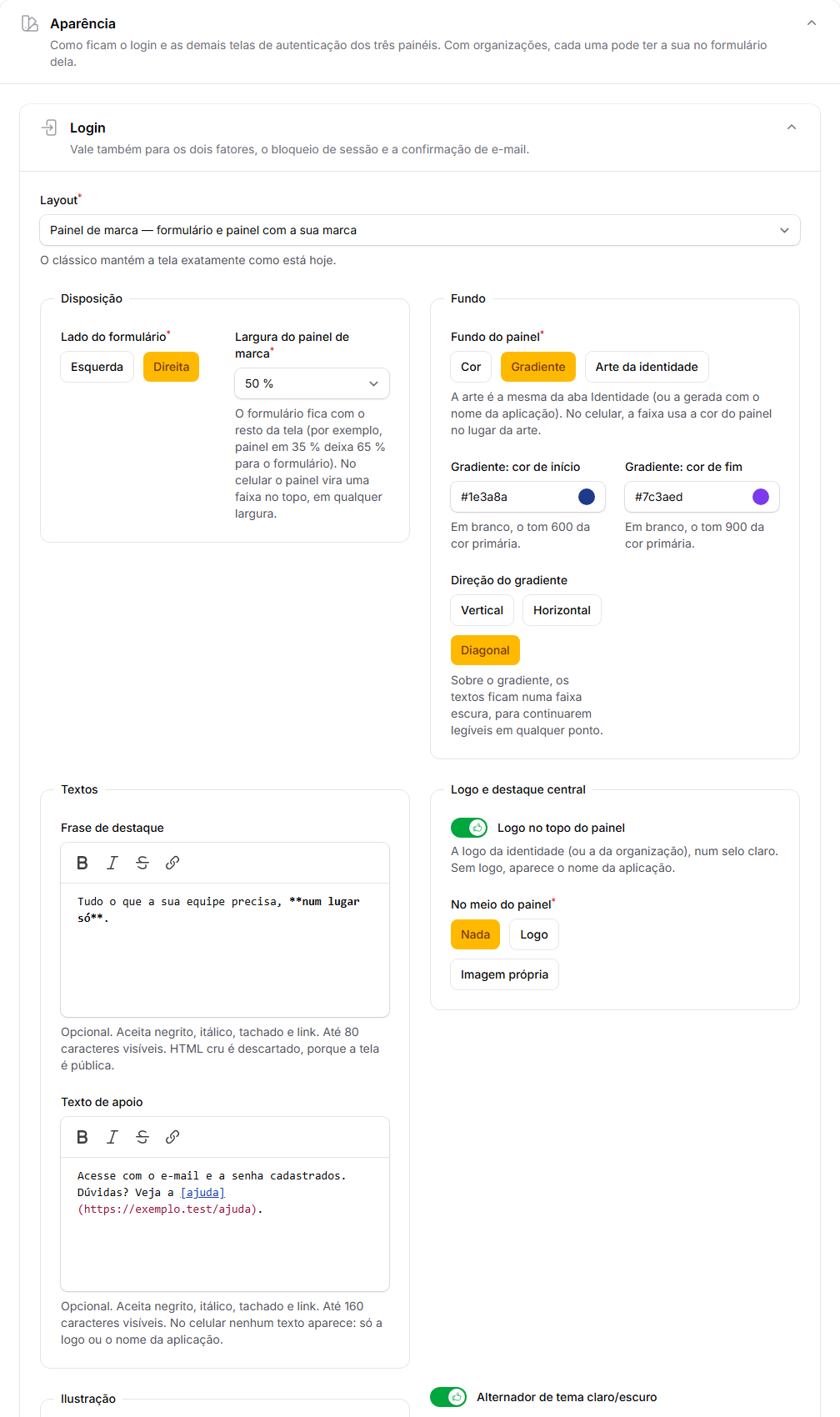
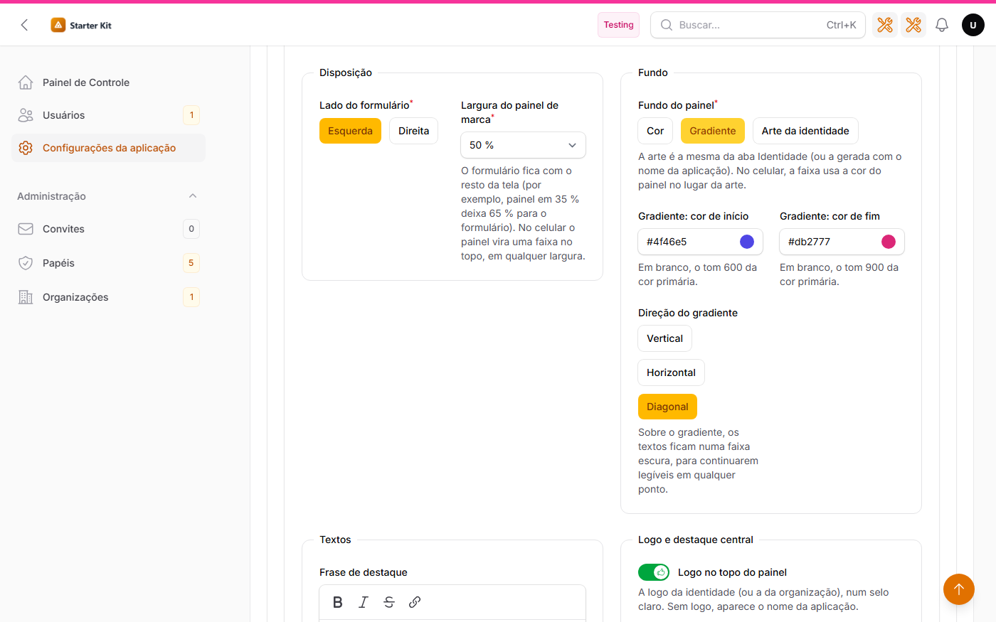
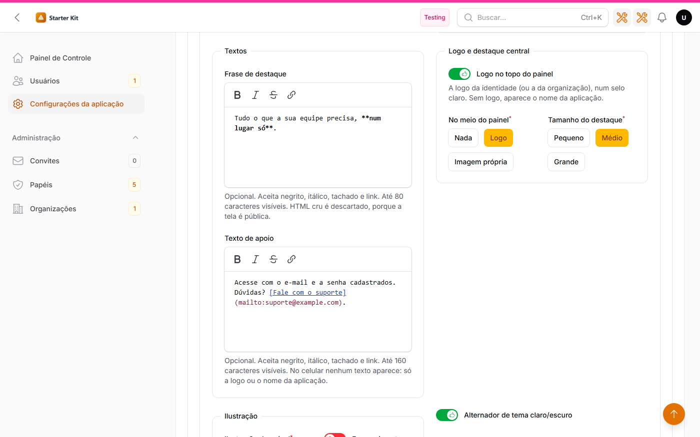
The editor, section by section — layout, background, texts, illustration, a screen with its own appearance and the preview:
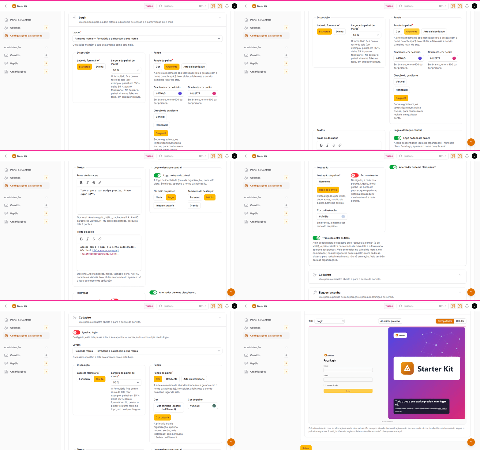
 |
 |
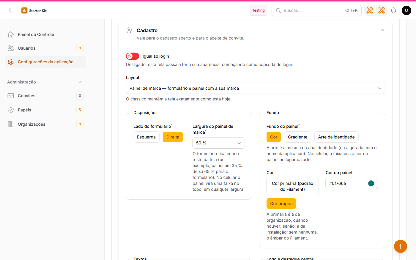 |
| Background: color, gradient or art | Texts with bold, italic and link | Sign-up with its own appearance |
| Option | What it does | Default |
|---|---|---|
| Form side | Left or right; the panel goes to the other side | Right |
| Brand panel width | 30% to 70% of the screen, in steps of 5; the form takes the rest (at 35%, the form takes 65%). It is the Auth Designer mediaSize. It does not apply on phones: there the panel is always the top strip |
50% |
| Panel background | Color, Gradient or Identity artwork — the same artwork as the Identity tab (or the artwork generated with the application name, when none was uploaded). A dark veil goes over the artwork, so the text stays readable | Color |
| Color | Primary color (Filament default) — the organization’s, when the screen belongs to an organization with its own color; otherwise the installation’s; with neither, Filament’s amber — or Custom color, in #RRGGBB format. With a light color, the panel text turns dark, so it stays readable |
Primary color |
| Gradient | Two #RRGGBB colors (blank: the primary’s 600 and 900 shades) and a direction — vertical, horizontal or diagonal. Over the gradient, the headline, supporting text and name sit on a dark band, in white, readable at any point |
Diagonal |
| Headline | Up to 80 visible characters, with bold, italic, |
Empty |
| Supporting text | Up to 160 visible characters, with the same formatting, right below the headline | Empty |
| Logo at the top of the panel | The identity logo (or the organization’s) on a light badge, which works on any background color. With no logo uploaded, the application name is shown | On |
| In the middle of the panel | Nothing, the Logo (the same as the top one, larger, on a light badge; with no logo, the application name in large letters) or an Image of your own | Nothing |
| Centerpiece size | Small, medium or large | Medium |
| Centerpiece image | PNG, JPEG or WebP, up to the kit upload limit. SVG is rejected. Stored on the public disk, in storage/app/public/telas-de-acesso/. If the file disappears from the disk, the centerpiece disappears and the screen keeps working |
— |
| Panel illustration | None or Network of dots: dots linked by lines, decorative, at the top of the panel | None |
| Moving | On, the network dots drift slowly and the screen gets a Pause the motion button (labelled “Pausar o movimento”); whoever asked the operating system to reduce motion sees the network still. Off, the network stays still | On |
| Illustration color | A #RRGGBB color for the network. Blank means the same color as the panel text |
Blank |
| Theme switcher | The light/dark/system selector in the corner of the screen | On |
| Transição entre as telas (transition between screens) | Only in the Login section, and it applies to all screens: going from login to sign-up or forgot password (and back), the panel slides to the other screen’s side and the form fades in. See below | On |
The sentences are yours: the editor shows an example as a placeholder, but the panel only shows what you write. Formatting is Markdown, like the login screen footer: the screen is public, so raw HTML is discarded, links only go out with a safe address, and typed images or headings don’t show. The limit counts the text that shows, not the markup (a long link doesn’t use up the 80 characters), with a 4 KB cap on the raw text. A sentence written before this version keeps showing exactly as before.
On phones, the top strip shows the logo only (or the application name, when there is no logo). With an artwork background, the strip uses the panel color instead of the image: the artwork often has the application name drawn on it, and it would sit behind the logo. Headline, supporting text, centerpiece and illustration only show from desktop width up (1024 px and wider).
Text is always treated as text: no field accepts HTML, CSS or script, and repeated or edge spaces are removed. A color outside the format, a text above the limit or an option outside the list is rejected with an error on the field itself, and nothing is saved.
Transition between screens
With login, sign-up and forgot password on the brand panel, moving from one screen to another is animated: when the form changes sides — for example, login with the form on the right and forgot password on the left —, only the panel slides to the other side, and the form fades in, without sliding. With the form on the same side on both screens, the panel stays put and only the content changes.
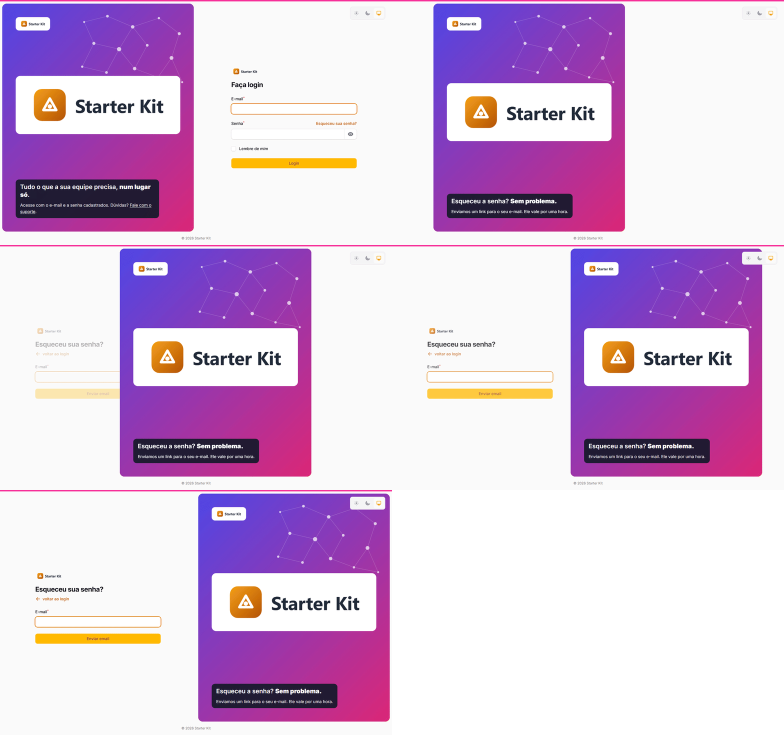
- The Transição entre as telas option lives in the Login section and applies to every screen, because the animation depends on both ends: the screen you leave and the screen you reach.
- With organizations, the installation’s option applies: forgot password always uses the default appearance, and the animation needs both screens — that’s why the organization form has no switch.
- Only between brand-panel screens: going to a classic screen, or after signing in, the change is the usual one.
- Only on desktop (1024 px and up). On phones the panel is the top strip and doesn’t change sides.
- People who asked their operating system to reduce motion get no animation.
- It is the browser’s View Transitions API, with no new JavaScript: it works in Chrome, Edge and Safari (18.2 or newer). Browsers without support switch screens without animation, as always.
The preview
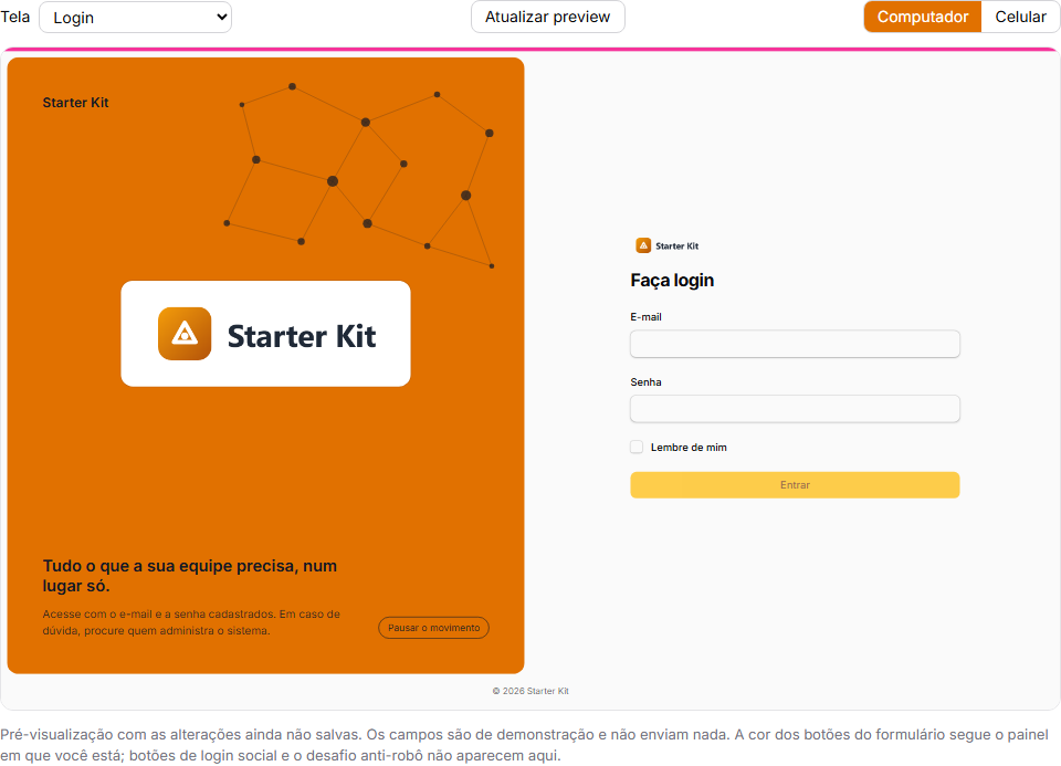
The Pré-visualização (preview) section shows the screen with the changes not saved yet:
- pick the screen (login, password request or registration) and the width (desktop or phone) — the frame has the size of a real screen (1440×900 or 390×844), scaled down to fit;
- a centerpiece image you just uploaded already shows in the preview, before saving;
- the preview refreshes by itself when a field changes; the Atualizar preview (refresh preview) button forces it;
- the preview fields are for show: they do not sign in, do not send e-mail and do not lead to a social provider.
Three limits, also written on the screen itself:
- The preview runs inside
/admin, so the form buttons come out with the admin panel color. The brand panel does come out with the right color — the organization’s included. - Social login buttons and the anti-robot challenge do not show in the preview; on the real screen they stay where they always were.
- The theme switcher is off in the preview: it stores the preference in the browser, and clicking it there would switch the theme of the settings screen itself.
The preview only opens for whoever gets into /admin and can save that scope — the default appearance requires the settings
screen permission; an organization’s, the permission to edit (or create) organizations — and only
with the person’s own draft. A preview address copied to someone else, or opened after 30 minutes
without use, answers 404.
Per organization
With organizations on, each organization’s form (/admin/organizacoes/{id}/edit, by default)
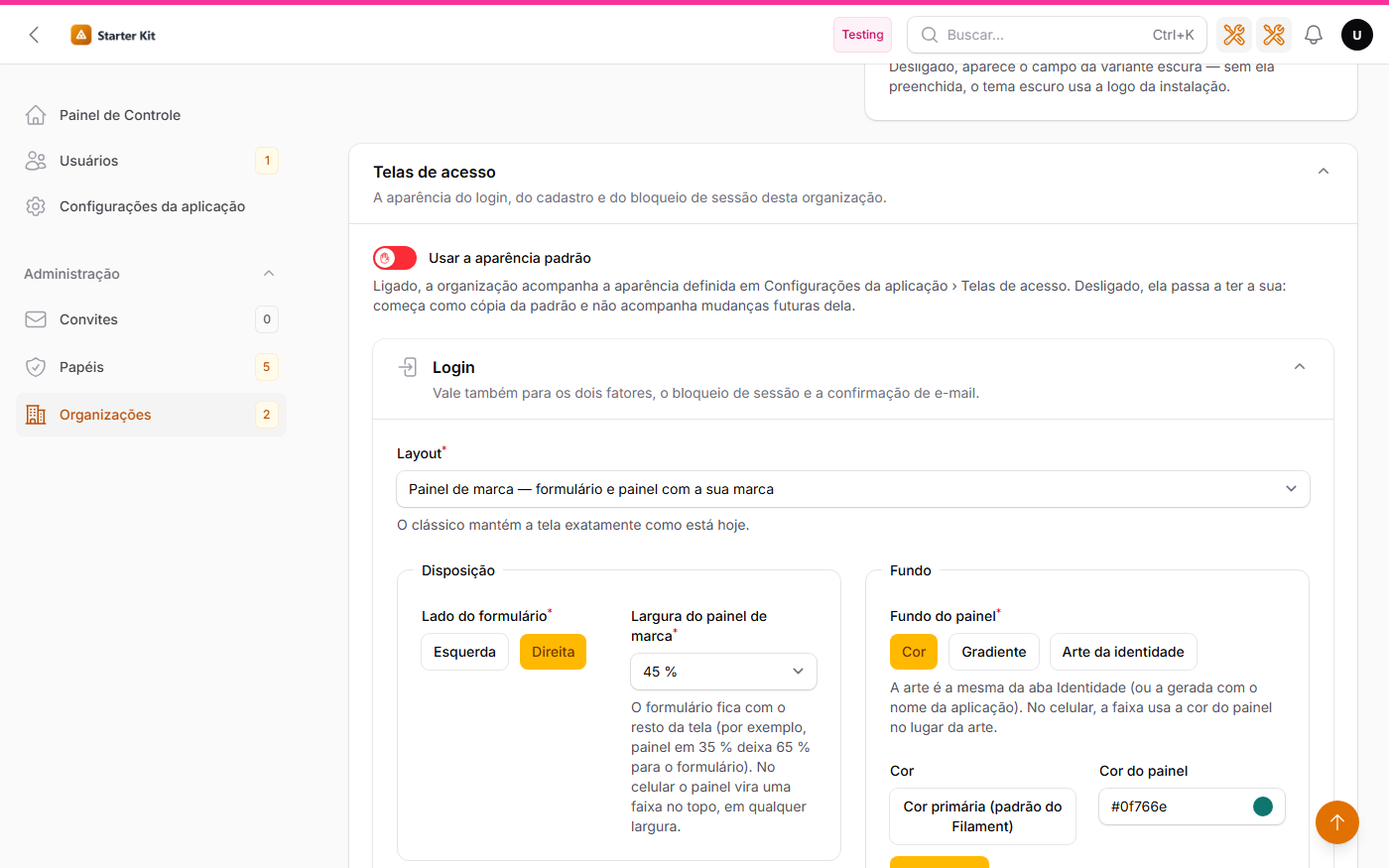
gains the Telas de acesso (sign-in screens) section, with the Usar a aparência padrão (use the default appearance) switch:
- on (the default): the organization follows the appearance set in Settings — future changes included;
- off: the organization gets its own. The editor starts with a copy of the default and, from then on, it no longer follows changes to the default. Same preview, with the organization’s color and logo.
Turning the switch back on discards the organization’s own appearance; turning it off later starts from a fresh copy of the current default.
The organization can pick the classic even when the default is the brand panel (and vice versa).
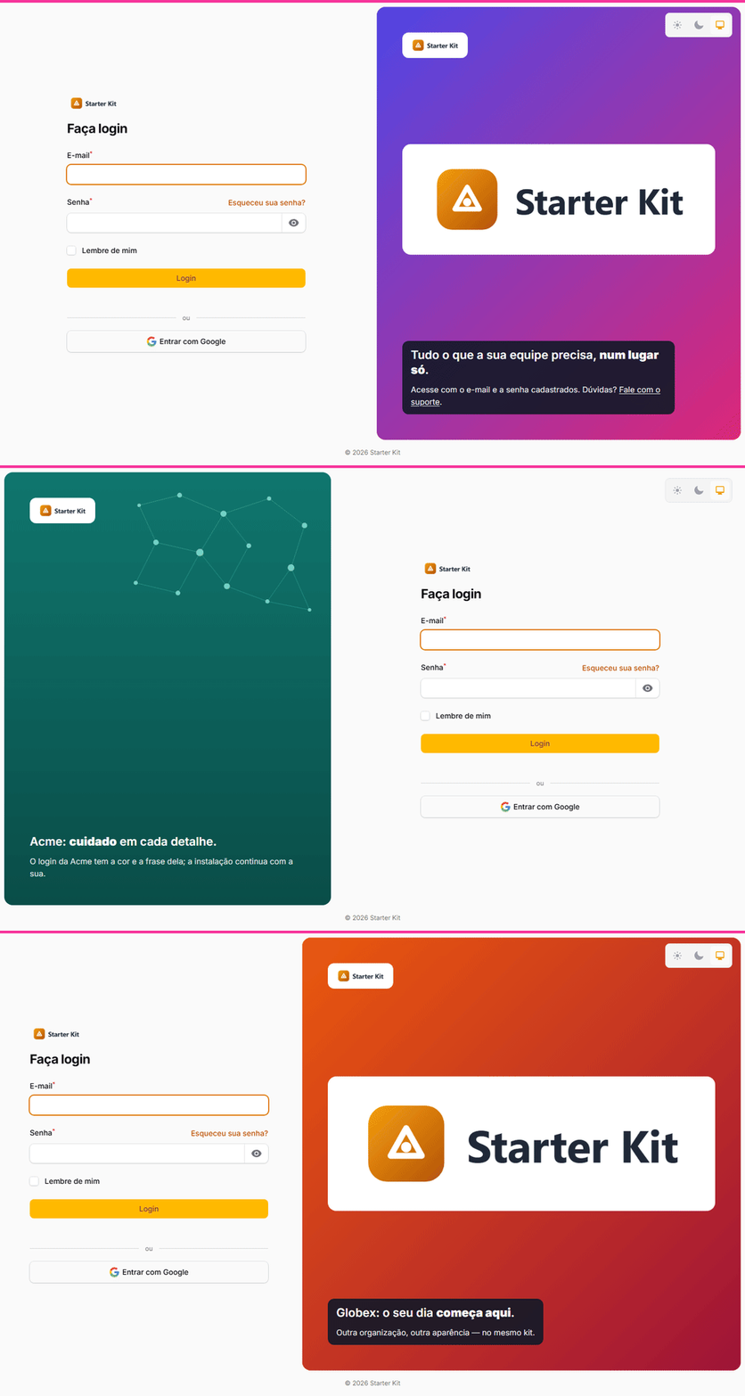
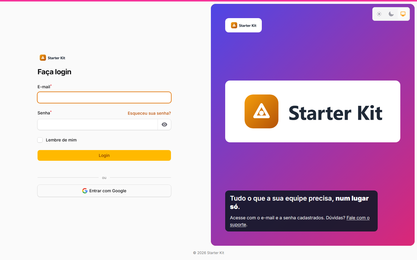
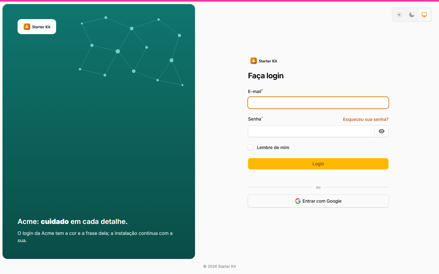
The same /app/login: without an organization, the default appearance; with ?org=acme and ?org=globex, each one’s own. Social login and the anti-bot challenge follow any appearance.
 |
 |
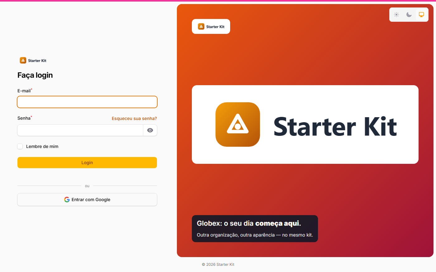 |
| Default appearance | Acme, with its own | Globex, with its own |
On which screen the organization’s appearance applies
The appearance only identifies the organization where that is safe and possible; everywhere else, the default applies:
| Screen | Organization considered | Without it |
|---|---|---|
/app login and /login |
the one in the URL’s ?org={slug}, if active |
default |
/app registration and /cadastro |
the open registration’s (?org=) or the invitation’s |
default |
Session lock in /app |
the organization the person was in | default |
| Password request and reset, e-mail confirmation, two factors | none | default |
Any /admin and /infra screen |
none | default |
| Any screen, with organizations off | none | default |
Once the organization is found, its own appearance applies — if it has one; otherwise, the default.
- Login: with
?org={slug}in the URL (/app/login?org=acme, or/login?org=acmewith the single page), of an active organization — it does not need to accept open registration. The appearance stays the same after a wrong password. - Registration: the organization’s open registration (
?org=) and accepting an organization’s invitation. - Session lock: the organization the person was in.
- Password request and reset, e-mail confirmation, two factors: always the default — those screens cannot safely tell which organization the person belongs to.
The appearance is only appearance: it never decides who gets in. That is still each panel’s access rule.
Updating a project that already uses the kit
php artisan kit:updatedelivers the classes, views and CSS; runphp artisan migrate(one settings migration and a newtenantscolumn, both empty) andphp artisan filament:assets.- After that the screens stay identical: the stored value starts empty, and empty is the classic.
- Switching layouts is always a decision of whoever administers, on the screen.
Whoever hand-customized the providers’ AuthDesignerPlugin block keeps that configuration on the
classic: the classic layout uses exactly what the providers build. The brand panel uses the
Identity tab artwork (not the provider’s media) and the switcher the providers configured, and decides the
rest by itself (the width and side chosen on the screen, no blur).
A brand panel appearance saved before the width, centerpiece and illustration options keeps looking the same on desktop: whatever it lacks takes the default — 50%, no centerpiece, no illustration. On phones, like every brand panel appearance, the strip now shows only the logo or the name (the headline goes away).
How it works inside
For whoever is going to extend the kit:
App\Support\AparenciaDasTelasDeAcessois the decider: it reads the appearance (the installation’s, or the organization’s falling back to the installation’s), reduces any stored value to the vocabulary — an unknown value never breaks the login screen, it falls back to the classic with a warning in theautenticacaolog — and applies the layout over the configuration the providers givecaresome/filament-auth-designer.- Every kit authentication page uses the
App\Filament\Concerns\VesteAparenciaDasTelastrait and overridesgetAuthDesignerConfig()in one line. A new authentication page does the same — and, like every authentication page, redeclares$layout. - The brand panel is rendered by the view
resources/views/filament/auth/painel-de-marca.blade.php, called by the package’smediapartial, which the kit already overrides. The package layout is not published: the screen structure, the footer and the authentication-screen detection stay the same. - The style lives in
resources/css/filament/kit.css, scoped to.kit-painel-de-marca— the classic does not have that class and is not reached. - The network is drawn on the server (
AparenciaDasTelasDeAcesso::rede(), always the same drawing) and the motion is an Alpine component in the view itself, with no external script: it honorsprefers-reduced-motion, stops when the tab is hidden and has the pause button. - The centerpiece image is only read from
telas-de-acesso/on the public disk: a stored path outside that directory is discarded. - The installation’s appearance lives in
ConfiguracoesDoKit::$aparencia_das_telas(config('kit.identidade.aparencia_das_telas')); the organization’s, in the JSON columntenants.aparencia_das_telas. Empty = classic for the installation and “use the default” for the organization. - The preview is the page
App\Filament\Pages\Auth\PreviewDasTelasDeAcesso, at the route/admin/preview-das-telas-de-acesso, with the draft kept in cache for 30 minutes under a key of the user’s own.
Why not a separate package
The customization depends on pieces that belong to the kit — the application settings, the
organizations, the identity and the permissions —, and kit:update delivers kit files but does not
install new packages. A package would require a manual composer require in every project and an
adapter for each of those pieces. That is why the customization lives in the kit, on top of the auth
designer, without modifying it.